
Design
Spread thin along the back, not stacked in the buckle
The hard part of a wearable is not the electronics, it is where you put them so the thing is still comfortable after eight hours. Almost every choice here comes from that.
The body side, labelled. Two haptic zones at the hips, the battery and control electronics along the back, USB-C behind a cover.
- 1Left hip haptics
- 2Right hip haptics
- 3Power / control spine
- 4USB-C, under a cover
The layout has a name we use internally, the distributed spine, and it means what it sounds like. Instead of one thick module, the parts are spread into flat zones: a 96 mm run of battery and control electronics along the small of your back, and one 50 mm haptic zone at each hip. The strain gauge is the exception: it sits in a bay machined into the buckle, so the strap itself is nothing but leather and a thin liner along its whole length.
Nothing in that list is thicker than 4.8 mm. Under the microfibre liner it reads as one continuous surface, with four shallow valleys that let the belt bend where it needs to. The alternative, a single block, is easier to build and much worse to wear.
The buckle carries no battery and no board. It is a machined mechanical part, 66 by 41 mm, and its jobs are to close the belt and to carry the strain bay and its charging contacts. The load path runs leather to metal to leather and never through anything electrical.
Decisions
Four questions people ask straight away
Why not put everything in the buckle?
A buckle big enough to hold a battery, two motors and a board stops being a buckle. It would be roughly the size of a matchbox and it would press into you every time you sat down. Spreading those parts along the strap keeps any single lump under 5 mm thick. The buckle carries exactly one electrical part, a strain gauge thinner than a third of a millimetre, because that is where the tension it has to read actually is.
Why is the buckle purely mechanical?
Because for four versions it was not, and the thing it was carrying does not exist any more. Until v0.8 the buckle held a cavity for a small audio module you pulled out and put in your ear. The cavity had 8.6 mm of usable depth, and an acoustic nozzle aimed into the ear at the angle a comfortable in-ear needs eats most of that before the body of the part even starts. Ten shapes were drawn. The ones that fitted stopped being earpieces; the ones that were earpieces wanted a buckle several millimetres thicker. So the feature was deleted rather than forced, and the buckle went back to being a buckle with a single strain gauge in it.
Why measure at the waist?
Because it is the one measurement this shape can take and nothing else can. A belt is already pulled tight around the part of you that changes, and the tension in the strap is a direct function of your circumference. A strain gauge in the load-bearing flexure reads it for pennies and for no extra thickness. The same signal also carries breathing, whether you are sitting or standing, and roughly when you have eaten. A watch cannot do any of this, and not for want of sensors: a watch is not tight around your middle.
Why does the leather carry the load?
Because flex cables fail and batteries do not like being pulled. The mechanical path runs leather to buckle to leather, and the electronics hang off it without ever being structural. Pull hard on the belt and you are pulling on leather and metal only.
Why a belt and not a wrist?
Because a wrist cannot measure a waist. Everything a watch reads, it reads through a strap you deliberately keep loose enough to be comfortable, on a limb that swings. A belt is tight by definition, sits on the part of the body whose size actually changes, and you already put one on without being asked to adopt a new habit. The trade is that a belt is a size problem in a way a watch is not, and we would rather solve that than pretend the wrist is a good place to measure from.
Does it behave differently on iPhone?
The hardware is identical and so is everything you touch. Measurement, haptics, the button, the briefing and the automations all run on both. The only real difference is plumbing: Android lets the app read notifications system-wide, while on iPhone the same filtering is built from the accounts you connect and from Focus modes. Same result for calls, messages, mail and calendar, which is where it matters.
Status
What is actually built
Renders are cheap and prototypes are not. Here is the line between the two, kept up to date.
- Product definition and dimensionsDone
- Industrial design and 3D modelDone
- Brand, site and waitlistLive
- Haptic left/right test with real peopleNext up
- Bench electronics: Bluetooth, button, motorsNot started
- Wearable prototypeNot started
- Companion app (built if there is demand)Not started
The next thing that happens is the cheapest and most important test in the whole plan: two vibration motors, a few people, and the question of whether a tap at the hip reliably reads as left or right through a layer of clothing. If that fails, the navigation idea fails, and no amount of industrial design saves it.
We would rather publish that than a launch date.
What it does not try to be
- It is not a fitness tracker. It measures nothing about your body, on purpose.
- No camera and no cellular radio, which is what keeps it thin and private.
- Nothing is listening by default. A voice session starts when you pull the module out.
- No water rating claimed until it has been tested properly.
- Not a phone replacement. It is the part of your phone you can feel.
- Not on sale yet. Pricing comes when there is hardware to price.
About what you are looking at
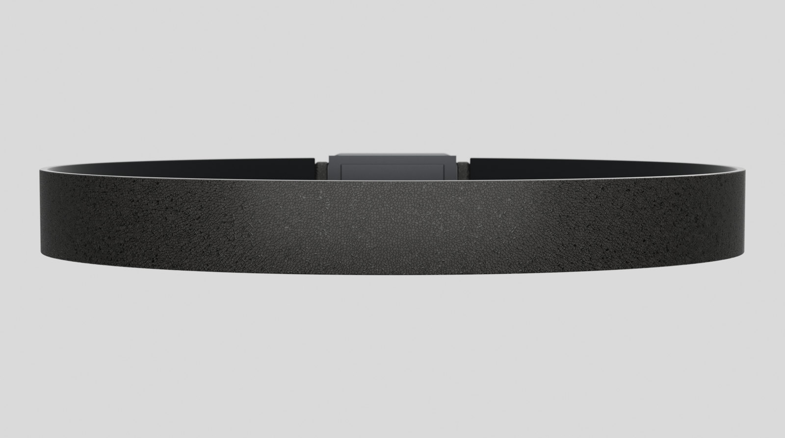
Every image on this site is rendered from one parametric design model, so the belt you see is physically the same object from every angle. It is not a photograph of finished hardware, because there is no finished hardware yet.
The finished product will differ from this in places. Once real components, stack-up, tolerances and wear testing get involved, some dimensions move and some ideas do not survive. That is what engineering does to a design, and anyone who tells you otherwise has not built anything. What we will do is change it in the direction of the best product we can make, and publish what moved and why instead of quietly replacing the pictures.
Told when it changes
The status list above is the thing we will email about. When a row moves, you hear.
Thinking about backing it instead? Read the investor page